3218303
Description
Mind Map by Gerardo Alfredo Merino Acosta, updated more than 1 year ago
|
|
Created by Gerardo Alfredo Merino Acosta
over 8 years ago
|
|
COLOR THEORY
- Well, as a designer in the digital era, you certainly don’t
have to stick to the colors available from paints, inks, or
other pigments, though there’s a lot we can learn from
fine art’s approach to color. In fact, the human eye can
see millions of different hues — but sometimes, choosing
even just two or three to use from those millions can
seem like a daunting task.
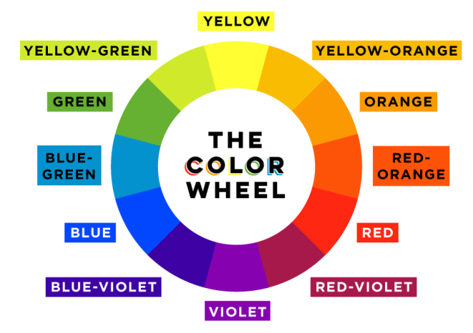
- The Color Wheel You’ve likely seen it in a school art class, or at
least are familiar with its stripped-down form: the primary colors of
red, yellow, and blue. We’ll be dealing with the traditional color
wheel of 12 colors, often used by painters and other artists. It’s an
easy visual way of understanding colors’ relationships with each
other.
- In Canva, we have our own version of the color wheel that you can pick
colors from. Any color you choose will be identified by a hexadecimal
value (or hex code), a six-digit combination of numbers and/or letters
(often preceded by #) used in many design programs to identify specific
colors when designing for the web.
- Color Terms Before we get into how to use the color wheel to create color palettes for
your designs, let’s take a quick look at some color-related terms that will help you
understand the different types of colors you might be using as you work on design
projects: Hue: synonymous with “color” or the name of a specific color; traditionally
refers to one of the 12 colors on the color wheel Shade: a hue darkened with black
Tone: a hue dulled with gray Tint: a hue lightened with white Saturation: refers to the
intensity or purity of a color (the closer a hue approaches to gray, the more desaturated
it is) Value: refers to the lightness or darkness of a color
- Color Harmony Now that we’ve got the more technical stuff out of the way, let’s look at how the color
wheel can be a practical resource in choosing colors for a design project. We can pull a number of classic
palettes from the color wheel that painters have been using for centuries to create balanced and visually
pleasing (or high-contrast and striking) compositions. In most design applications, these color schemes
will need to be split into one dominant color — dominant either because of how much it appears in the
design, or because of how it stands out in comparison with other colors — and one or more accent
colors.
- 1) Monochromatic: various shades, tones, or tints of one color; for instance, a range of blues varying from
light to dark; this type of scheme is more subtle and conservative2) Analogous: hues that are side by side
on the color wheel; this type of scheme is versatile and easy to apply to design projects 3)
Complementary: opposites on the color wheel, such as red/green or blue/orange; complementary colors
are high-contrast and high-intensity, but can be difficult to apply in a balanced, harmonious way
(especially in their purest form, when they can easily clash in a design) 4) Split-Complementary: any color
on the color wheel plus the two that flank its complement; this scheme still has strong visual contrast,
but is less jarring than a complementary color combination 5) Triadic: any three colors that are evenly
spaced on the color wheel 6) Tetradic/Double-Complementary: two complementary pairs; this scheme
is very eye-catching, but may be even harder to apply than one pair of com
- Color Inspiration In addition to the color combinations found in the color wheel, nature provides endless
inspiration for harmonious color schemes. For 25 great palettes pulled from nature photography (as well
as others inspired by travel, food & drink, and everyday items), check out another of our Design School
articles, “100 Brilliant Color Combinations: And How to Apply Them to Your Designs.”
- Color is all around us. Whether we realize it or not, it plays a big role in our everyday lives. That orange or
yellow traffic sign you saw on the road today? It caught your attention for a reason. That box of cereal
you bought at the market even though it was a little more expensive than the others? You might have
been drawn to the colors on its packaging. Color even creeps its way into language… why do we say
people are “seeing red” when they’re angry or “feeling blue” when they’re sad? Because color has a
unique connection to our moods and emotions.
Media attachments
Want to create your own Mind Maps for free with GoConqr? Learn more.