Good design is vital for brand building and customer acquisition, but it takes extreme attention to detail. These tips cover the most important things to watch out for if you're a non-designer.
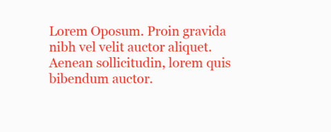
Typography is 90% of design. This is why getting it right is so hard.Apply the line height of 1.6 to all body text. In CSS, you’d simply add line-height: 1.6 to all p elements. If this is a printed piece, simply take the body text font size and multiply it by 1.6.
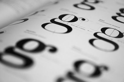
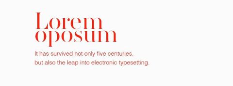
Properly picking fonts and combining them is hard. To make things easier on yourself, pick only 2 — one for body text and one for headlines. Then multiply the body font size by 2.5 to get the headline size.See? Design is math.
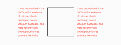
Each time we get to the end of a column, our eyes struggle to catch the next line. To make the text more scannable (and to make design look more professional), limit your lines to 58 characters per line.Here’s a jQuery plugin to help you with that.
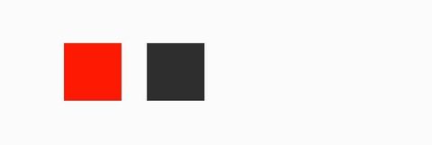
Pick only 2 colours to work with and give each one a task. For example, you may use orange for all call to actions and blue for branding elements.Most of all, make sure to only use exactly the chosen colours — don’t try to match it by feeling as it will look totally different on different screens. Use a colour picker and sass variables.
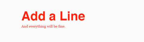
In designs with heavy use of typography, it can be hard to get it all right.Adding a line underneath the text or on the side will help visually separate content. Take any printed news for example — chances are, they use the same technique to group content together.
If a layout doesn’t look quite right, it’s very likely the result is due to a lack of macro white space.The trick here is to start leaving more space around elements than you’re comfortable with. Keep in mind that white space is not empty space. It’s a graphical tool.
Instead of using centre align on everything, try aligning your text it to left to spice things up. In layouts rich in white space, aligning to left can give off a sense of luxury.
When you need a quick illustration, icons can save your life. You can even use them to create simple logos.But where they shine the most is in adding that extra little touch to information design. Instead of simply listing stats, add tiny icons to each list item.
Instead of using grids with 12 columns, you can simplify the concept and simply split your layout into 3 of 4 columns and make sure elements are aligned to the same vertical and horizontal lines.
Staying consistent should be your number one priority when you’re build a brand. Large companies may have 100-page documents for this, but ain’t nobody got time for that! Simply create a short style guide using the template below.Click here for a free template.Source: Design for Founders
