8019813
Descripción
Diagrama por Celi Merchant, actualizado hace más de 1 año
|
|
Creado por Celi Merchant
hace alrededor de 7 años
|
|
Nodos de los diagramas
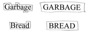
- Word Shape Theory
- It's not true that UPPERCASE TEXT is harder to read than Mixed Case Text or lowercase text.
- ... But people aren't as used to reading uppercase, so they read it more slowly. Also, it's perceived as SHOUTING, so use sparingly.
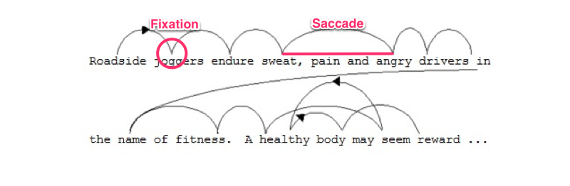
- Saccade and Fixation
- Our eyes move in quick, sharp jumps as we read text (not fluidly). Our eyes mostly jump forward, but also look backward occasionally.
- Saccade = when your eye jumpsFixation = moment of stillness
¿Quieres crear tus propios Diagramas gratis con GoConqr? Más información.