3245852

SAB7#81
7-tools_Basic_Quality
- Pareto Charts
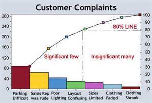
- Help you to figure out which problems need your attention right away. They're based on the idea that a
large number of problems are caused by a small number of causes. In fact, that's called the 80/20 rule. ( 80%
of the defects are usually caused by 20% of the causes.
- Help you to figure out which problems need your attention right away. They're based on the idea that a
large number of problems are caused by a small number of causes. In fact, that's called the 80/20 rule. ( 80%
of the defects are usually caused by 20% of the causes.
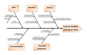
- Cause and Effect Diagrams
- They are used to figure out what caused a defect. You list all the categories of the defects that you
have identified and then write the possible causes of the defect you are analyzing from each category
Annotations:
- Is also called fishbone and Ishikawa diagrams
- They are used to figure out what caused a defect. You list all the categories of the defects that you
have identified and then write the possible causes of the defect you are analyzing from each category
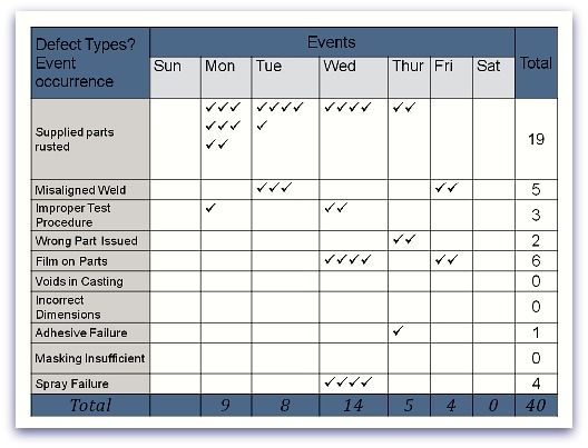
- Checksheets
- Is a type of checklist that can be used to keep track of data on the product under test. Checksheets are
often used as a means o gathering the data that's displayed in Pareto Diagrams or other charting tools.
Annotations:
- Is also called tally sheets.
- Is a type of checklist that can be used to keep track of data on the product under test. Checksheets are
often used as a means o gathering the data that's displayed in Pareto Diagrams or other charting tools.
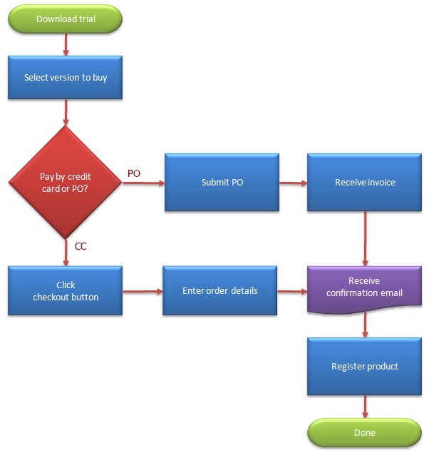
- Flowcharts
- Show how a process or system flows from beginning to end, how the elements interrelate, alternative paths the process
can take and how the process translates inputs into outputs. They are also good for showing decisiong-making process
Annotations:
- Is also called Process Map
- Show how a process or system flows from beginning to end, how the elements interrelate, alternative paths the process
can take and how the process translates inputs into outputs. They are also good for showing decisiong-making process
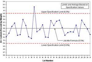
- Control Charts
- Are used in Control Quality to help determine if the results of a process are within acceptable limits. Can
also be used to monitor things like project performance figures, such a cost and schedule variances.
- Are used in Control Quality to help determine if the results of a process are within acceptable limits. Can
also be used to monitor things like project performance figures, such a cost and schedule variances.
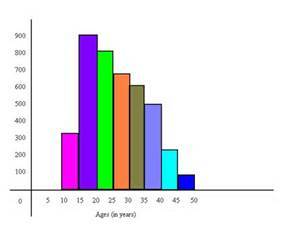
- Histograms
- A histogram displays data in the form of bars or columns. This tool helps identify which
problems are worth dealing and give you a good idea of how your data breaks down.
- A histogram displays data in the form of bars or columns. This tool helps identify which
problems are worth dealing and give you a good idea of how your data breaks down.
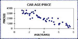
- Scatter Diagrams
- This diagram tracks 2 variables to determine their relationship. A regression line (or trend line) is
calculated to show the correlation of variables, and can then be used for estimation and forecasting.
- This diagram tracks 2 variables to determine their relationship. A regression line (or trend line) is
calculated to show the correlation of variables, and can then be used for estimation and forecasting.
Media attachments
Want to create your own Mind Maps for free with GoConqr? Learn more.