1849276
Description
Mind Map by Joshua “Latymerm, updated more than 1 year ago
|
|
Created by Joshua “Latymerm
over 9 years ago
|
|
Clean Bandit Synergistic
Marketing Campaign
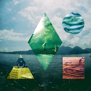
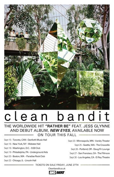
- Album Art
- Their tour poster also features their album art with the 4 iconic
shapes that they use throughout their different art works
- Merch
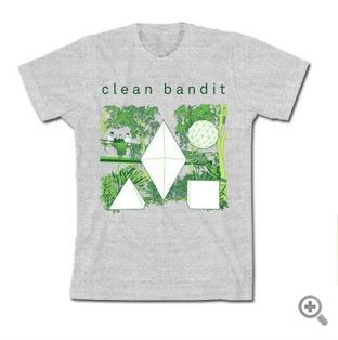
- The design on most of their merch is based around
the album art, such as this T Shirt for example,
which also sticks to the grey and green colour
scheme which appears on the website and on their
album cover
- The design on most of their merch is based around
the album art, such as this T Shirt for example,
which also sticks to the grey and green colour
scheme which appears on the website and on their
album cover
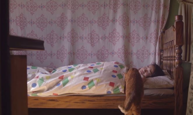
- Their iconic 4 shapes that they use in their album art
translates into their other products too, including their music
video.
- In this scene the icons are on the bed sheets.
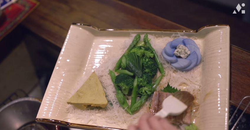
- Their iconic shapes made out of sushi!
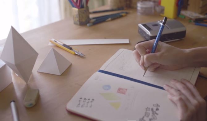
- And on her desk too!!
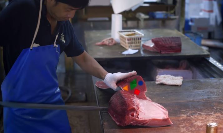
- And in this slice of meat!
- In this scene the icons are on the bed sheets.
- Their tour poster also features their album art with the 4 iconic
shapes that they use throughout their different art works
- Website Landing Page
- The website landing page features their
album which shares the same iconography
ad their album/single art. It links to iTunes
where the visitor can download the album.
This synergy is particularly useful to the
artist as it provides purchasing opportunity
to the visitor of the website
- The geenery and
natural imagery used on the
landing page is also used on the
tour poster
- The greenery and natural imagery used
throughout the campaign, especially for the art
for their single 'Rather Be' was also present at
the start of their video for Rather Be
- The greenery and natural imagery used
throughout the campaign, especially for the art
for their single 'Rather Be' was also present at
the start of their video for Rather Be
- The website landing page features their
album which shares the same iconography
ad their album/single art. It links to iTunes
where the visitor can download the album.
This synergy is particularly useful to the
artist as it provides purchasing opportunity
to the visitor of the website
- Font
- The font used throughout their different
platforms and products is always kept
very similar. Their logo is always in thin,
rounded, lower case, simple letters.
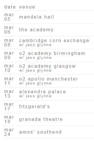
- The font on
their website is
often grey, this
is shown
especially on
their tour dates
page
- To match the grey/muted coloured font on
the website, they also have pale grey social
network icons
- To match the grey/muted coloured font on
the website, they also have pale grey social
network icons
- The font on
their website is
often grey, this
is shown
especially on
their tour dates
page
- The font used throughout their different
platforms and products is always kept
very similar. Their logo is always in thin,
rounded, lower case, simple letters.
- Tour Poster
Media attachments
Want to create your own Mind Maps for free with GoConqr? Learn more.