
Karteikarten
W7: RESPONSIVE DESIGN
Karten in diesem Stapel (12)
- 1What is the advantage of developing mobile first?it gives you the opportunity to think on what is most important to display or present to the user, you got limited space.
Most access websites using their phones - 2grid-column-start: 1; grid-column-end: 3; what is the shorthand method?Grid-column: ⅓
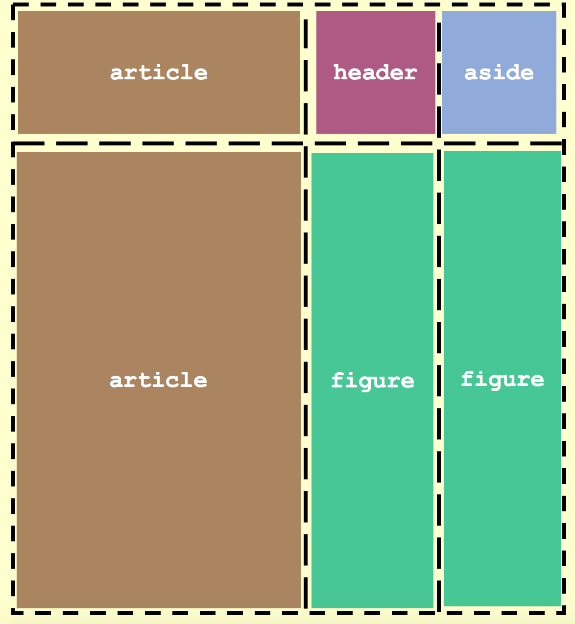
- 3—.page{
display:grid;
grid-template-columns: 2fr 1fr 1fr;
grid-template-rows: 4em auto;
grid-template-areas:
"article header aside"
"article figure figure";
}
header{
grid-area: header;
}
figure{
grid-area: figure;
}
article{
grid-area:article;
}
aside{
g - 4What is an "em"?An em is equal to the current font-size, for instance, if the font-size of the document is 12px, 1em is equal to 12px.
- 5If screen size is >= 600px wide@media screen and (min-width: 600px) {}
- 6What is the viewport?A viewport is a term for the visible area of a webpage on a display device
The viewport varies with the device, and will be smaller on a mobile phone than on a computer screen. - 7Screen size vs resolutionThe screen size is, specifically, the physical width or height of your monitor's screen.
On the other hand, a screen resolution is how many pixels wide and tall fit onto said screen. - 8What is DIP?Device Independent
Pixels
It allows you to render content independent of the pixel density of the device - 9What is resolution?Resolution is the number of pixels on a device found in each dimension (width × height) that can be displayed on the screen. For example, a device with the resolution of “1024 × 768” has a 1024-pixel width and a 768-pixel height.
- 10what is pixel density?Pixel Density is usually measured in PPI (Pixels Per Inch), which refers to the number of pixels present per inch on the display. A higher pixel density per inch allows for more sharpness and clarity when using the device.
- 11how can we use the metatag "viewport" to better render things on mobile?This means that the browser will (probably) render the width of the page at the width of its own screen. So if that screen is 320px wide, the browser window will be 320px wide, rather than way zoomed out and showing 960px (or whatever that device does by default, in lieu of a responsive meta tag).
- 12what is the meta viewport tag doing?it tells the browser that we are designing content for different browser
Informationen
- Beschreibung
- Webdev Karteikarten am W7: RESPONSIVE DESIGN, erstellt von Emma Tysk am 18/06/2019.
- Erstellt von
- Emma Tysk
- Aufrufe
- 0
- Bewertung