
Mapa mental
Evaluation: Inspections, Analytics, and Models
Contenido del mapa
Evaluation: Inspections, Analytics, and Models
Heuristic Evaluation
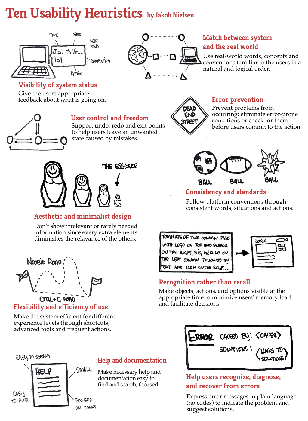
- In heuristic evaluation, experts, guided by a set of usability principles known as heuristics, evaluate whether user-interface elements, such as dialog boxes, menus, navigation structure, online help, and so on, conform to tried and tested principles.
- Nielsen
- Visibility of system status
- The system should always keep users informed about what is going on, through appropriate feedback within reasonable time
- Match between system and the real world
- The system should speak the users’ language, with words, phrases, and concepts familiar to the user, rather than system-oriented terms. Follow real-world conventions, making information appear in a natural and logical order.
- User control and freedom
- Users often choose system functions by mistake and will need a clearly marked emergency exit to leave the unwanted state without having to go through an extended dialog. Support undo and redo.
- Consistency and standards
- Users should not have to wonder whether different words, situations, or actions mean the same thing. Follow platform conventions.
- Error prevention
- Even better than good error messages is a careful design that prevents a problem from occurring in the first place. Either eliminate error-prone conditions or check for them and present users with a confirmation option before they commit to the action.
- Recognition rather than recall
- Minimize the user's memory load by making objects, actions, and options visible. The user should not have to remember information from one part of the dialog to another. Instructions for use of the system should be visible or easily retrievable whenever appropriate.
- Flexibility and efficiency of use
- Accelerators – unseen by the novice user – may often speed up the interaction for the expert user such that the system can cater to both inexperienced and experienced users. Allow users to tailor frequent actions.
- Aesthetic and minimalist design
- Dialogs should not contain information that is irrelevant or rarely needed. Every extra unit of information in a dialog competes with the relevant units of information and diminishes their relative visibility.
- Help users recognize, diagnose, and recover from errors
- Error messages should be expressed in plain language (no codes), precisely indicate the problem, and constructively suggest a solution.
- Help and documentation
- Even though it is better if the system can be used without documentation, it may be necessary to provide help and documentation. Any such information should be easy to search, focused on the user's task, list concrete steps to be carried out, and not be too large.
- Visibility of system status
- Nielsen
- Budd (Website)
- Clarity
- Make the system as clear, concise, and meaningful as possible for the intended audience.
- Write clear, concise copy-Only use technical language for a technical audience-Write clear and meaningful labels-Use meaningful icons.
- Make the system as clear, concise, and meaningful as possible for the intended audience.
- Minimize unnecessary complexity and cognitive load
- Make the system as simple as possible for users to accomplish their tasks.
- Remove unnecessary functionality, process steps, and visual clutter-Use progressive disclosure to hide advanced features-Break down complicated processes into multiple steps-Prioritize using size, shape, color, alignment, and proximity.
- Make the system as simple as possible for users to accomplish their tasks.
- Provide users with context
- Interfaces should provide users with a sense of context in time and space.
- Provide a clear site name and purpose-Highlight the current section in the navigation-Provide a breadcrumb trail-Use appropriate feedback messages-Show number of steps in a process-Reduce perception of latency by providing visual cues (e.g. progress indicator) or by allowing users to complete other tasks while waiting.
- Interfaces should provide users with a sense of context in time and space.
- Promote a pleasurable and positive user experience
- The user should be treated with respect and the design should be aesthetically pleasing and promote a pleasurable and rewarding experience.
- Create a pleasurable and attractive design-Provide easily attainable goals-Provide rewards for usage and progression.
- The user should be treated with respect and the design should be aesthetically pleasing and promote a pleasurable and rewarding experience.
- Clarity
- In heuristic evaluation, experts, guided by a set of usability principles known as heuristics, evaluate whether user-interface elements, such as dialog boxes, menus, navigation structure, online help, and so on, conform to tried and tested principles.
Preece, Jenny, Helen Sharp, Yvonne Rogers. Interaction Design: Beyond Human-Computer Interaction, 4th Edition. John Wiley & Sons UK, 2015-05-18. VitalBook file.
- Anna Christina Muhlbach Castelán
Imágenes y archivos del mapa
Información
- Descripción
- Mapa Mental sobre Evaluation: Inspections, Analytics, and Models, creado por Anna Muhlbach el 23/11/2017.
- Creado por
- Anna Muhlbach
- Visitas
- 0
- Valoración