1829246
Description
Mind Map by norgat9051, updated more than 1 year ago
|
|
Created by norgat9051
over 9 years ago
|
|
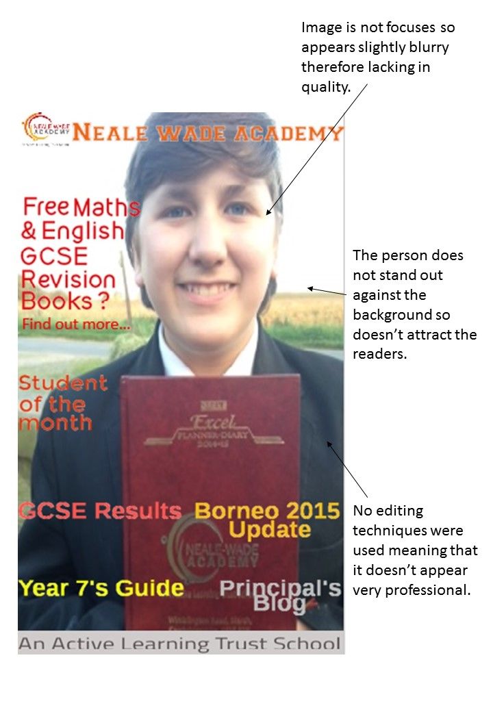
Evaluation, Question 7-Progress
- Preliminary Task
- Music Magazine
- Imagery Editing Contrast
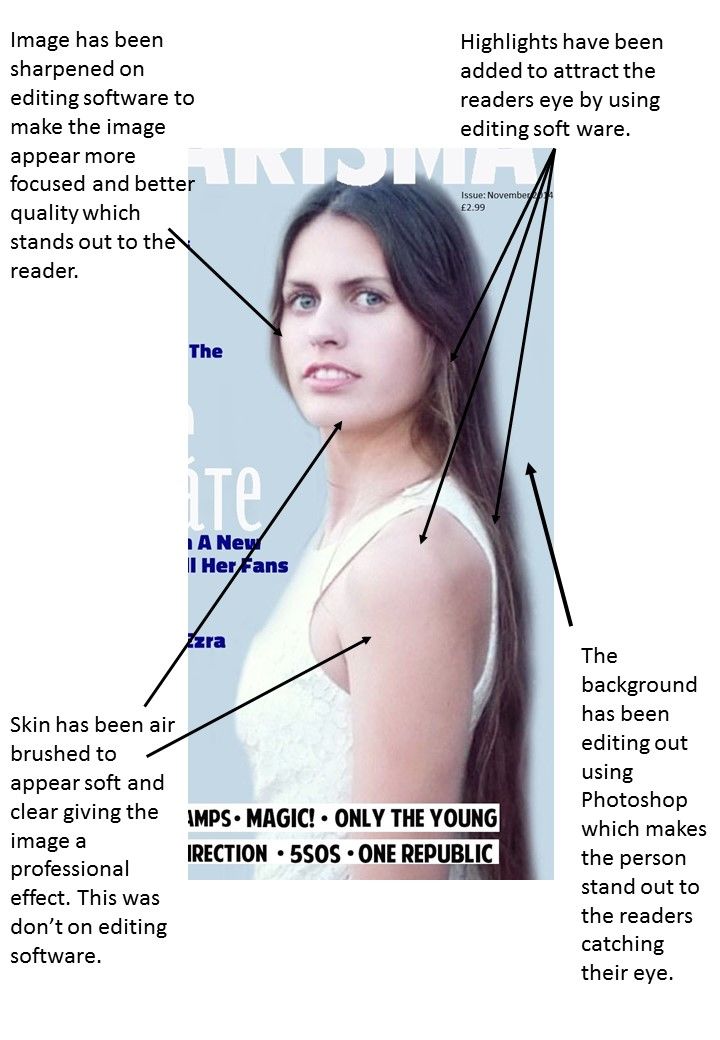
- Progress made
is editing
techniques have
enabled me to
establish a
better quality
image which
attracts readers
and displays a
professional
effect.
- Progress made
is editing
techniques have
enabled me to
establish a
better quality
image which
attracts readers
and displays a
professional
effect.
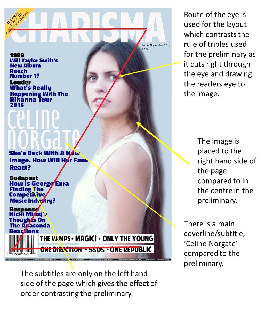
- Layout Contrast
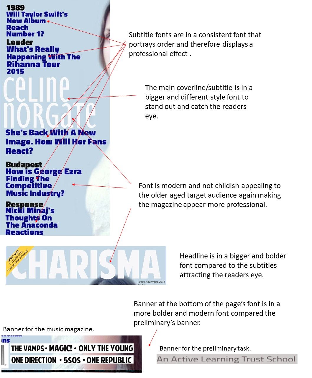
- The progress I've made is to arrange
the subtitles neatly to connote order
and give a professional effect. Also
learnt that image placement is
important to draw the readers eye.
- The progress I've made is to arrange
the subtitles neatly to connote order
and give a professional effect. Also
learnt that image placement is
important to draw the readers eye.
- Font Contrast
- Progress made is
a font that is
bolder and more
conventional to
appeal to the
target audience.
Also learnt how to
size is important
to appear more
ordered and
professional.
Learn that a main
cover line is more
conventional.
- Progress made is
a font that is
bolder and more
conventional to
appeal to the
target audience.
Also learnt how to
size is important
to appear more
ordered and
professional.
Learn that a main
cover line is more
conventional.
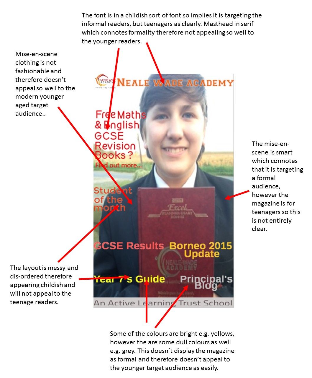
- Photography & Mise-en-scene Contrast
- Progress made is I
understand how
camera angle is
important for the
mise-en-scen for
appealing to the
target audience. I
have acknowledge
that clothing is a
key factor in
connecting and
attracting the
target audience.
- Progress made is I
understand how
camera angle is
important for the
mise-en-scen for
appealing to the
target audience. I
have acknowledge
that clothing is a
key factor in
connecting and
attracting the
target audience.
- Colour Contrast
- Progressed mad is
that the colours
need to be bright
and bold to draw the
readers attention
and how the
masthead needs to
be in a bold
colouring for the
reader to be
attracted to it and
remember it.
- Progressed mad is
that the colours
need to be bright
and bold to draw the
readers attention
and how the
masthead needs to
be in a bold
colouring for the
reader to be
attracted to it and
remember it.
- Mode Of Address
- Progress made is
that technical
elements like font,
colour and
mise-en-scene are
important for
portraying the
mode of address.
- Progress made is
that technical
elements like font,
colour and
mise-en-scene are
important for
portraying the
mode of address.
Media attachments
Want to create your own Mind Maps for free with GoConqr? Learn more.