2000567
Description
Mind Map by crosbyblogger, updated more than 1 year ago
|
|
Created by crosbyblogger
almost 11 years ago
|
|
Evaluation Q3 - Audience Feedback On
The Final Drafts Of Our Ancillary Tasks
- Magazine Poster
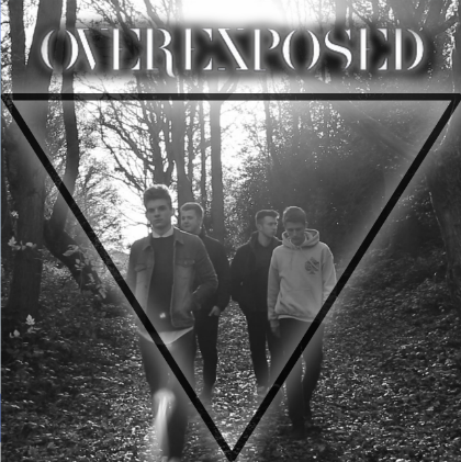
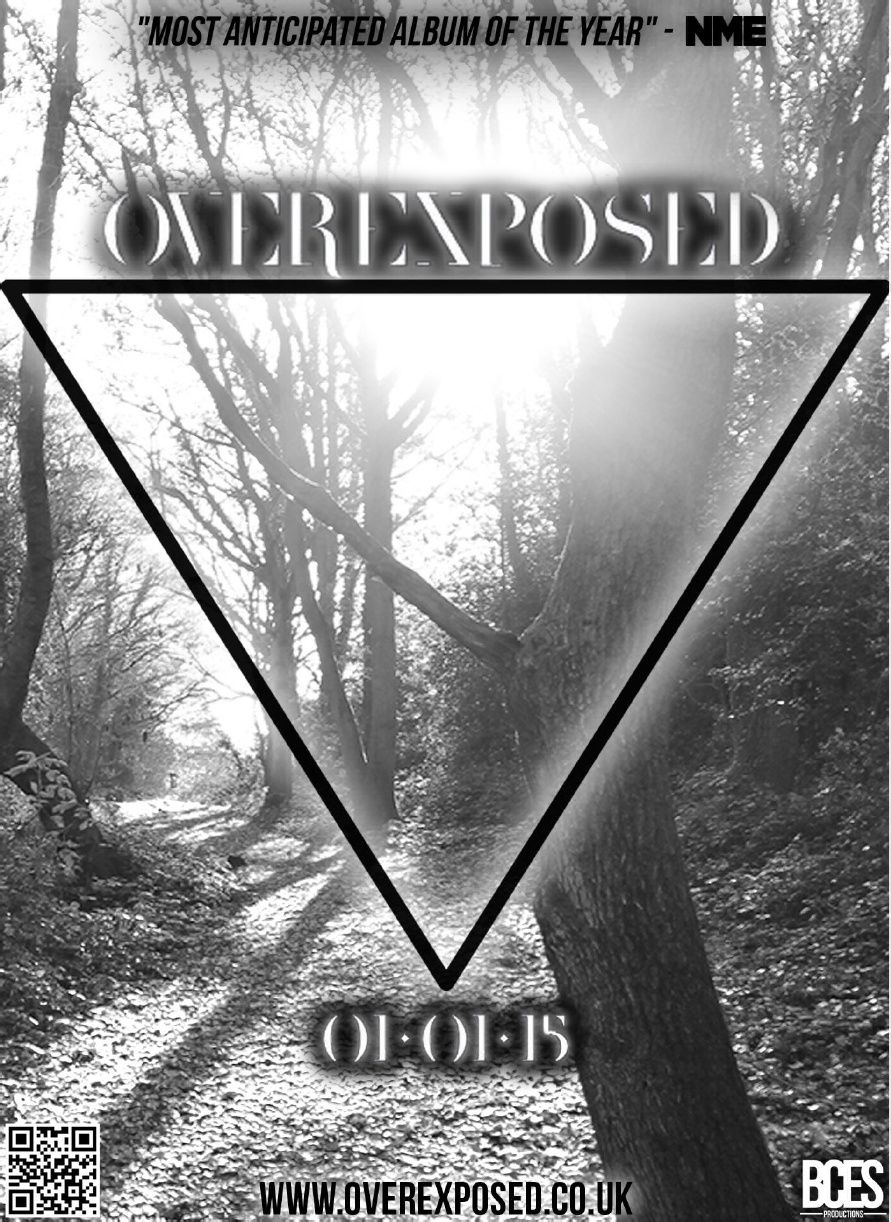
- Teacher Feedback - It was mentioned that the website at the
very bottom could potentially be a tiny bit smaller as that
isn't the main aspect of Magazine Poster and she feels like
this has the potential to drag their attention away from the
more important aspects on the poster, such as the QR Code
and Release Date, and this could be a problem if they only
briefly look at the Poster. She commented on the fact that the
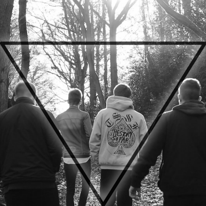
background image is very well taken and it looks like
something which would actually be on a real mainstream
artist Magazine Poster.
- Target Audience Feedback - The demographic audience really liked the
Magazine Poster, many commented on the professionalism of the poster
while others mentioned the logo and how it was a good idea that we
branded our band. A lot of our audience noticed the QR Code and said it
was a good idea that we have thought about social media and the
significance that it has on the music industry and media forms nowadays.
A few people however did mention the fact that the black outer
glow/shadow effect looks quite amateur however the white outer
glow/shadow effect around the other pieces of text and images do look
good.
- Teacher Feedback - It was mentioned that the website at the
very bottom could potentially be a tiny bit smaller as that
isn't the main aspect of Magazine Poster and she feels like
this has the potential to drag their attention away from the
more important aspects on the poster, such as the QR Code
and Release Date, and this could be a problem if they only
briefly look at the Poster. She commented on the fact that the
background image is very well taken and it looks like
something which would actually be on a real mainstream
artist Magazine Poster.
- Digipak
- Teacher Feedback - Our teacher's main criticism was the fact that the
'Lyrics Page' doesn't really fit in too well with the pages within the Digipak
- it has a different font and a complete black background which is
completely different to the other pages. However, apart from that
criticism she said the continuity throughout was very good and each page
was quite unique and different. It was also mentioned that the Digipak
front cover gives a bold and strong statement about our Star Image.
- Target Audience Feedback - Our audience commented on the use of
black and white colour scheme and how it stays the same throughout
the Digipak, they said it showed that we thought about Continuity
within the Digipak. Another thing which they said showed Continuity
was the fact that the scenery and background we used is the same as
one of the scenes within our Music Video - this was something we were
aiming to acheive, and their feedback proved that we had accomplished
this.
- Teacher Feedback - Our teacher's main criticism was the fact that the
'Lyrics Page' doesn't really fit in too well with the pages within the Digipak
- it has a different font and a complete black background which is
completely different to the other pages. However, apart from that
criticism she said the continuity throughout was very good and each page
was quite unique and different. It was also mentioned that the Digipak
front cover gives a bold and strong statement about our Star Image.
Media attachments
Want to create your own Mind Maps for free with GoConqr? Learn more.