609677
Description
Mind Map by james.s.craine, updated more than 1 year ago
|
|
Created by james.s.craine
about 10 years ago
|
|
Film Magazine Planning
- After completing some film magazine
research I noticed that the masthead on many
film magazines is the largest text on the page
and is usually in capital letters. This makes the
name of the magazine easy to see and read to
customers know which magazine they are
buying. It also catches the audiences eye and
they may then be tempted into purchasing the
magazine.
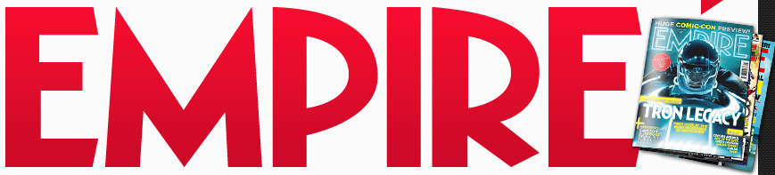
- As you can see below Empire
magazines masthead is the
largest text on the page and is in
capital letters so it stands out.
- If my magazine is to be recognisable I
will have to make my masthead large on
the page so it stands out and customers
instantly recognise my magazine from
the rest as it is a competitive market.
- After looking at potential fonts for my masthead on the
website Dafont.com, I found 3 which I thought would be
best to use for my magazine. These fonts are all easy
to read and stand out which is what a masthead font
needs to be.
- After looking at potential fonts for my masthead on the
website Dafont.com, I found 3 which I thought would be
best to use for my magazine. These fonts are all easy
to read and stand out which is what a masthead font
needs to be.
- If my magazine is to be recognisable I
will have to make my masthead large on
the page so it stands out and customers
instantly recognise my magazine from
the rest as it is a competitive market.
- My magazine masthead must also be in a font which
is easy for the audience to read of confusion over the
name of the magazine could occur.
- As you can see below Empire
magazines masthead is the
largest text on the page and is in
capital letters so it stands out.
- Key Cover Line
- The purpose of a key cover line is to sell the
main article to the audience. The key cover line
briefly sums up what the main article is about in a
way which makes the audience to want to read
the article themselves to find out what the key
cover line is telling them.
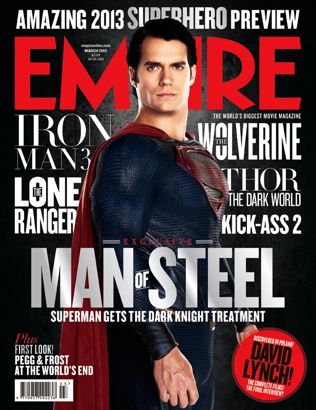
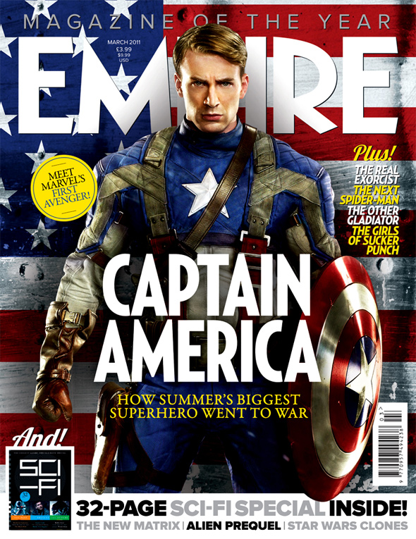
- As you can see with this issue of Empire
magazine the key cover line reads "How
summer's biggest superhero went to war".
This cover line helps to sum up what the
main article is about and it ties in to the
image and
- The purpose of a key cover line is to sell the
main article to the audience. The key cover line
briefly sums up what the main article is about in a
way which makes the audience to want to read
the article themselves to find out what the key
cover line is telling them.
- Cover Lines
- Cover lines are used on a magazine to provide audience
members a brief explination as to some of the content within
the magazine. In a film magazine case they are usually the
names of films covered in the magazine or actors names who
have been interviewed.
- I intend to include a number of cover lines
to attract audiences to read the
magazine.I was thinking of including
around 5 cover lines, as any more might
make the front cover look cluttered.
- Possible cover lines I
was thinking of were:
GODZILLA PREVIEW,
BATMAN Vs SUPERMAN,
10 Hottest films around,
Harry Burj Interview! and
Siam Park Film Fest!
- Cover lines are used on a magazine to provide audience
members a brief explination as to some of the content within
the magazine. In a film magazine case they are usually the
names of films covered in the magazine or actors names who
have been interviewed.
- Colour Scheme
- The colour scheme of many film magazines
usually consists of 3 colours. This makes
the magazine visually appealing and catches
the eye.
- I quickly knew which colours I wanted to use on my magazine
front cover. They can be seen above. These colours are simple
but effective on the eye. They are fairly dark which adds to the
films genre of being quite a dark sinister film.
- The colour scheme of many film magazines
usually consists of 3 colours. This makes
the magazine visually appealing and catches
the eye.
- Image
- Many film magazine covers have an image of a
main character from the featured film on the
cover. The image is usually a mid-shot and the
character is positioned centrally on the page.
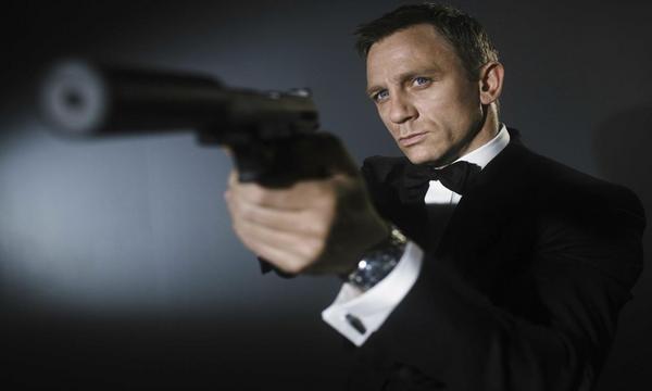
- This is the kind of image I hope to create
for my magazine cover. The pose and
prop of the gun show that this character is
not to be messed with and means
business, something Chrisitan portrays in
the trailer
- This is the kind of image I hope to create
for my magazine cover. The pose and
prop of the gun show that this character is
not to be messed with and means
business, something Chrisitan portrays in
the trailer
- For my image I will be having the
character Christian Maddox pointing a
gun at somebody while looking at the
camera. The shot will be a mid-shot and
he will be positioned centrally. I have
decided to use Christian as the character
to have on my cover as he is one of the
key protaganists and he appears in the
trailer the most.
- Many film magazine covers have an image of a
main character from the featured film on the
cover. The image is usually a mid-shot and the
character is positioned centrally on the page.
Media attachments
Want to create your own Mind Maps for free with GoConqr? Learn more.