1937298
TV GUIDE magazine analysis
- COLUMNS
- Article text split across four
columns to break up text and look
less bulky and intimidating to the
potential readers. This is a more
aesthetically pleasing way of
formatting a TV guide article as it
is more inviting for the audience,
making them more likely actually
read the article and watch the
programme being discussed.
- Of a consistent and uniform width
across, making the article seem
more professional and
subconsciously "put together".
- Text all right-justified.
This helps create white
space and make the
page less overwhelming
for the potential reader,
without having to
eliminate any content.
- Article text split across four
columns to break up text and look
less bulky and intimidating to the
potential readers. This is a more
aesthetically pleasing way of
formatting a TV guide article as it
is more inviting for the audience,
making them more likely actually
read the article and watch the
programme being discussed.
- PAGE NUMBERS
- Found In bottom corners of
page, with the magazine name
alongside of it. This is uniform
across all pages and allows
readers to keep track of
whereabouts in the magazine
they are, as well as subtly
reinforcing the name of the
magazine for the audience.
- In same font as rest of page's
content. This leads to a subtle
consistency and
realism/professionalism.
- Found In bottom corners of
page, with the magazine name
alongside of it. This is uniform
across all pages and allows
readers to keep track of
whereabouts in the magazine
they are, as well as subtly
reinforcing the name of the
magazine for the audience.
- LAYOUT
- The overall layout of the page is to have all of the separate features (e.g.
separate article and supplementary pictures) packed quite close
together, making the page easy to get to grips with. This means the
readers will spend less time jumping over the page and around the
magazine looking for the information they want. Any information leading
to a different page is noted to be on the following page.
- FONTS
- Fonts used in headers are all sans serif.
- This has connotations of being more casual than serf
fonts, which are often used for formal magazines and
newspapers. This suits the product that is being sold and
makes the page and article feel friendly.
- Main article text and by line are both in serif
fonts. This is because it is likely for the
audiences to take note of these fonts, and read
the actual article and information involved
than worry over how the words look. It is also
important to note that most audiences are
reasonably familiar with these types of serif
fonts, as they are commonly used in letters
and such. This makes the information in the
article simpler to take in.
- This has connotations of being more casual than serf
fonts, which are often used for formal magazines and
newspapers. This suits the product that is being sold and
makes the page and article feel friendly.
- The fonts used for the headers are are
all in bright colours to carry on house
style. The bright house style makes this
page pop out in the magazine and
draws the reader in more.
- Fonts used in headers are all sans serif.
- MODE OF ADDRESS AND LANGUAGE USED
- Casual language is used throughout the article,
making it feel friendlier for the audiences. This is
important to note, as often readers of TV guides
and magazines are looking for light reading and
not an in-depth and intense article.
- The mode of address is
usually direct, makes
more personal for
reader and as if they are
getting a secret in-look
to Dame Edna's career
and upcoming show.
- Casual language is used throughout the article,
making it feel friendlier for the audiences. This is
important to note, as often readers of TV guides
and magazines are looking for light reading and
not an in-depth and intense article.
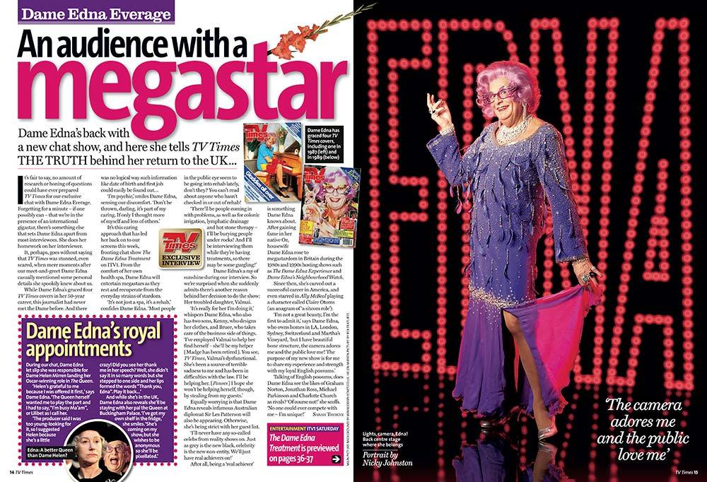
- MAIN IMAGE
- This emphasises the USP of the
program (i.e. Dame Edna) and
draws readers in with friendly
pose as explained elsewhere.
- This emphasises the USP of the
program (i.e. Dame Edna) and
draws readers in with friendly
pose as explained elsewhere.
- IMAGE/TEXT
INTEGRATION
- Uses the star that the
magazine are
interviewing as a draw if
readers are perhaps
flicking through the
magazine looking for
something interesting.
- Other pictures relating to side
articles; "royal appointments".
There is a lot of visual stimuli
for the audiences to take in on
this page alone. This is
especially good as all of the
pictures are related to the
article and nothing feels out of
place; otherwise this would
have been a lot more
noticeable.
- Uses the star that the
magazine are
interviewing as a draw if
readers are perhaps
flicking through the
magazine looking for
something interesting.
- MAIN HEADING/TITLE
- As explained with
connotations/denotations,
the word "megastar" alone
draws the audience in fully,
and sensationalises the
content of the magazine.
This makes it more likely for
the audience to watch the
featured program.
- As explained with
connotations/denotations,
the word "megastar" alone
draws the audience in fully,
and sensationalises the
content of the magazine.
This makes it more likely for
the audience to watch the
featured program.
- HOUSE STYLE
- Features bright colours to reflect
star's personality and media
presence, pinks and purples. This
makes the audience connect the two
and makes the page as a whole feel
more consistent and true to Dame
Edna's brand. This makes the colours
seem to stick out less; they would be
more noticeable if they felt out of
place or perhaps even clashed with
the colours in the main image.
- TARGET AUDIENCE
- The audiences that read TV
guides/magazines are often
casual readers of all ages,
looking most often for
something interesting to
watch or for something to
catch their attention.
Fittingly, the double page
spread article needs to
jump of the page to the
reader and hook them in as
quickly as possible. This
article does this well.
- SHOT TYPES
- long shot
- Also connotes the costume is of
importance or relevance; Dame
Edna being a drag queen will often
wear elaborate costumes, so this is
focused on in this shot.
- This connotes that it is wanted for
the readers to see full body, and
emphasises the friendly fun pose,
making them seem more interesting
in the article and more likely to read
about the star and program.
- Also connotes the costume is of
importance or relevance; Dame
Edna being a drag queen will often
wear elaborate costumes, so this is
focused on in this shot.
- mid shot
- Shots in smaller images are mid-shots, friendlier and
closer to camera to be inviting for the audience,
making them feel more close to the subject.
- Similarly to the long shots focusing on constue,
these focus on Dame Edna's make-up, an
important aspect of the drag aesthetic. This leads
the audience to be more intrigued by the star.
- Shots in smaller images are mid-shots, friendlier and
closer to camera to be inviting for the audience,
making them feel more close to the subject.
- long shot
- DATE AND ISSUE NUMBER?
- The date and issue numbers are
most often seen exclusively on
contents page and front cover;
as this is an article from the
middle of the magazine there is
no necessity for them to be
there.
- The date and issue numbers are
most often seen exclusively on
contents page and front cover;
as this is an article from the
middle of the magazine there is
no necessity for them to be
there.
- RULE OF THIRDS
- This is arguably challenged, as the double page spread
seems to be more in halves. HOWEVER, it is important to
note that being a double spread, there will be two separate
pages. It seems the separate article on "Dame Edna's royal
appointments" as well as the supplementary pictures are
both in hotspots where the readers attention is already
drawn to. This makes them quickly picked up on by the
audience and taken in by the audience straight away.
- BORDERS ON IMAGES?
- The dotted border around the
separate article comes across as
casual, inviting, friendly, suiting the
overall feel of the page and house
style. This makes the audience more
compelled to "stay on the page" if it is
aesthetically pleasing, meaning they
will have read a large reach of the
articles, most likely all of it.
- It also carries over the dots in
background of main image,
subliminally creating a
consistency on this one page
alone. This consistency gives the
magazine a professional feel.
- The dotted border around the
separate article comes across as
casual, inviting, friendly, suiting the
overall feel of the page and house
style. This makes the audience more
compelled to "stay on the page" if it is
aesthetically pleasing, meaning they
will have read a large reach of the
articles, most likely all of it.
- MASTHEAD?
- Here, the star's name in
place of the masthead as an
overhead for the article to
allow audiences to easily
identify who the article is
about, if it weren't clear
enough already.
- Here, the star's name in
place of the masthead as an
overhead for the article to
allow audiences to easily
identify who the article is
about, if it weren't clear
enough already.
- CAPTIONS IN PICTURES
- Here, the caption
tells readers the
photographer of
the images. This is
important for the
magazine to give
credit for the
images used.
- The other caption
here is a GRAB QUOTE.
- Here, the caption
tells readers the
photographer of
the images. This is
important for the
magazine to give
credit for the
images used.
- USE OF SPACE
- Features are cluttered and packed quite
close together, seems like loads more
information for the audience to dig their
teeth into, making the article more
interesting and wanting them to read it.
- There is whitespace visible as to make
the page seem less overwhelming for
the reader, while at the same time no
skimping on or compromising any of
the content,
- Features are cluttered and packed quite
close together, seems like loads more
information for the audience to dig their
teeth into, making the article more
interesting and wanting them to read it.
- OVERALL IMPRESSION
- The overall of this double page spread
alone is that the program will be fun,
entertaining and actually interesting. This
is a combination of the house style and its
consistency, the main image, the
connotations/denotations, the by line and
overall layout.
- The overall of this double page spread
alone is that the program will be fun,
entertaining and actually interesting. This
is a combination of the house style and its
consistency, the main image, the
connotations/denotations, the by line and
overall layout.
- DROP CAP
- The "I" is a drop cap here,
indicates start of article for
easy identification of
article's start, making the
page easier to navigate
than had it otherwise been
absent.
- The "I" is a drop cap here,
indicates start of article for
easy identification of
article's start, making the
page easier to navigate
than had it otherwise been
absent.
- DENOTATION
- "Megastar" literally would mean a
celebrity with fame reaching
perhaps an international level.
Dame Edna is most certainly a
megastar, and so the audience
immediately are drawn to the
article with the mention and focus
on such a huge personality, making
the article and related TV
programming more appealing and
interesting to the audience. This
may also draw in audiences who
hadn't considered the
article/program.
- "THE TRUTH" also senationalises the article,
making the article seem gritty and may
include juicy gossip which audiences may be
interesting. Such buzz words will intrigue the
audiences reading the magazine and article.
- "Megastar" literally would mean a
celebrity with fame reaching
perhaps an international level.
Dame Edna is most certainly a
megastar, and so the audience
immediately are drawn to the
article with the mention and focus
on such a huge personality, making
the article and related TV
programming more appealing and
interesting to the audience. This
may also draw in audiences who
hadn't considered the
article/program.
- CONNOTATIONS
- In main image having Edna's name in lights
makes her seem a more famous person, as the
connotations of "a name in lights" is Hollywood
and fame. This is a deliberate choice on the
part of the magazine editors to create this
feeling.
- "Megastar" also
intensifies the feelings of
fame with connotations
of the start perhaps
being that next level of
"star" and being more
important than they
perhaps could be.
- In main image having Edna's name in lights
makes her seem a more famous person, as the
connotations of "a name in lights" is Hollywood
and fame. This is a deliberate choice on the
part of the magazine editors to create this
feeling.
- GRAB QUOTES
- This is designed to draws
reader in with quote from
the article, seems
endearing and fun in this
case, makes article seem
more intriguing.
- This is designed to draws
reader in with quote from
the article, seems
endearing and fun in this
case, makes article seem
more intriguing.
- BY LINE
- Underneath main title to give audience
quick information related to the article,
as well as draw them in with buzz
phrases such as "THE TRUTH".
- Underneath main title to give audience
quick information related to the article,
as well as draw them in with buzz
phrases such as "THE TRUTH".
- EDITOR'S NOTE
- Editorials are often found
only in the contents page,
and as this is a double page
spread, it is fittingly absent.
- Editorials are often found
only in the contents page,
and as this is a double page
spread, it is fittingly absent.
Media attachments
Want to create your own Mind Maps for free with GoConqr? Learn more.