Sankey diagrams

Description

GCSE Science (Energy for the home - P1) Note on Sankey diagrams , created by Tom Pass on 11/05/2016.
Tom Pass
Note by Tom Pass, updated more than 1 year ago
Tom Pass
Created by Tom Pass almost 8 years ago
33
1

Resource summary

Page 1

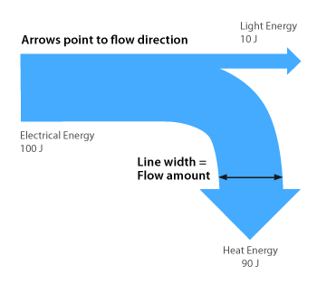
The thickness of the arrow represents the amount of energy.Sankey diagrams are just energy transformation diagrams – they make it easy to see at a glance how much of the input energy is being usefully employed compared to how much is being wasted. The thicker the arrow, the more energy it represents – so you see a big thick arrow going in, then several smaller arrows going off to show the different energy transformations taking place.

Show full summary Hide full summary

Similar

Biology Revision - Y10 Mock
Tom Mitchell
Biology- Genes and Variation
Laura Perry
AQA Physics P1 Quiz
Bella Statham
Acids and Bases
Sarah Egan
Using GoConqr to teach science
Sarah Egan
Using GoConqr to study science
Sarah Egan
GCSE Combined Science
Derek Cumberbatch
Physics Revision
Tom Mitchell
The Circulatory System
Shane Buckley
Acids and Bases
silviaod119
Elements, Compounds and Mixtures
silviaod119