
15. Pattern recognition helps people identify letters in different fonts
Slides do conjunto (2)
-
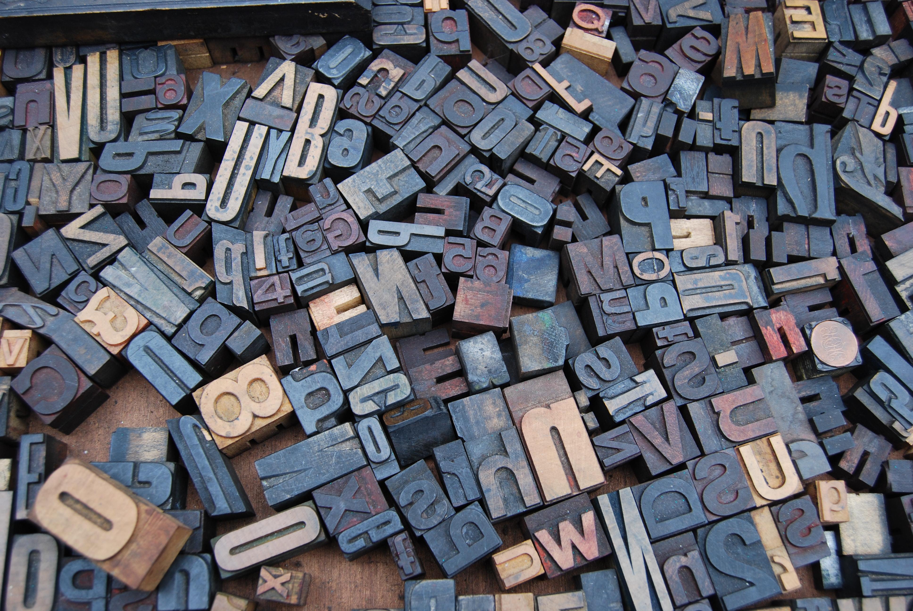
- Fonts matter right? Of course! But maybe not as much as you think.
- If you've taken a typography course, you'll likely have heard the sage advice to use a serif typeface for books or long passages of text.
- Sans serif typefaces are normally recommended for screen reading.
- - The truth?
- Both are equal in terms of readability.
-
Beware: Decorative = Difficulties
- Any designer will tell you that typeface choices are important. The right typeface can bring out the personality in the piece and make it really stand out in the readers mind. In terms of readability, as long as the typeface's letters are easy to identify, you're good to go.
- On that note though: BEWARE OVERLY DECORATIVE TYPEFACES
- - If an overly decorative typeface is used for instructions, the perceived difficulty of the instructions themselves is actually increased.
- If you want people to actually follow the instructions you're giving them, you need to make it as approachable and friendly as possible (such as Arial, Helvetica etc)
Informações
- Descrição
- In this module, we go over how pattern recognition and font have a relationship with reading.
- Criado por
- Katlynne Custer · out 2020
- Atualizado
- 22 out 2020
- Visualizações
- 37
- Tags
- Avaliação