
Fichas
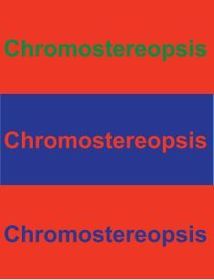
10. Red and blue together are hard on the eyes

Fichas del conjunto (5)
- 1Does Red text on a blue background strain your eyes?Yes, try to avoid red on blue backgrounds. You can change the values of the colors to make them look better together.
- 2Does Blue text on a Red background strain your eyes?Yes, try to avoid blue on red backgrounds. You can change the values of the colors to make them look better together.

- 3Does green text on a Red background strain your eyes?Yes, try to avoid Green on Red backgrounds. You can change the values of the colors to make them look better together.

- 4What colors should you try to avoid on a red background?Blue and green.
- 5Which of the colored text shows up the best?Definitely the bottom two. The blue text on red is the one that pops out the most.

Información
- Descripción
- Learn what colors you should avoid putting together.
- Creado por
- Jacob Sobie
- Visitas
- 39
- Valoración