
Fichas
Typ2 Quiz Flashcards
Fichas del conjunto (22)
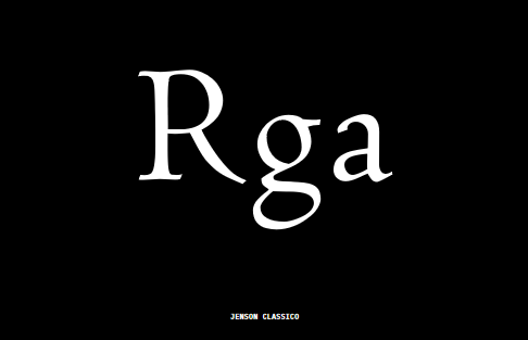
- 1—Humanist serif
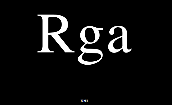
- 2—transitional serif
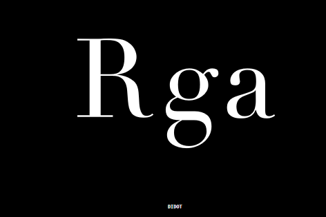
- 3—rational serif
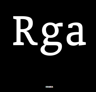
- 4—contemporary serif
- 5—grotesk sans
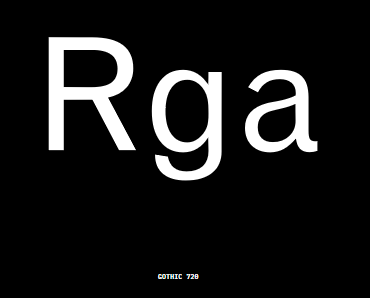
- 6—neo grotesk
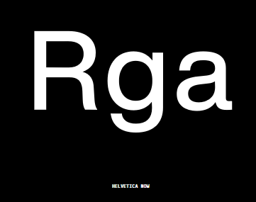
- 7—geo sans
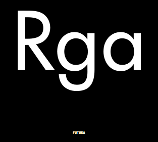
- 8—neo-humanist sans
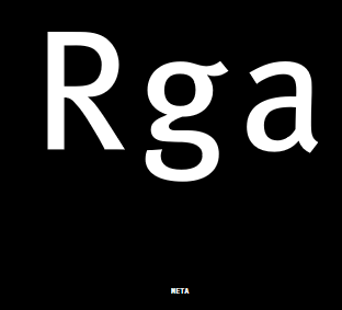
- 9—Humanist Sans
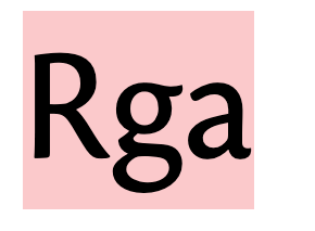
- 10—grotesk slab
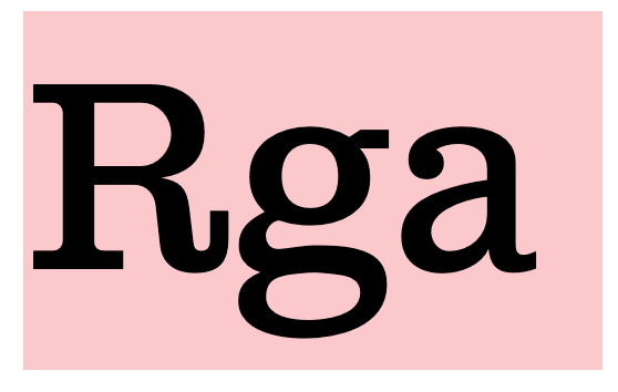
- 11—Humanist slab
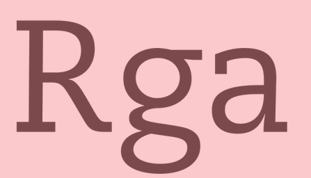
- 12italic vs obliqueitalic text is DESIGNED to be at a slant. oblique is the opposite (look more into this/see pwrpoint)
- 13small capsspecially designed glyphs
- 14calligraphic flowtype with no flow can see benefit from letterspacing lowercase letters
- 152 standards for first line indents1: Hanging
2: Non-Hanging?? - 16—1: Hyphen
2: En dash
3: Em Dash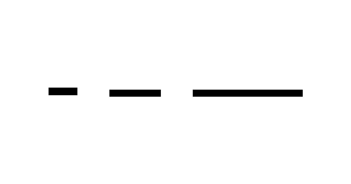
- 17Solid & Negative Leading1: Solid: where both size and leading are same size
2: Negative: where leading is less than type size. Works depending on the type. - 184 factors for typographic color1: letter spacing
2: design of a font
3: word spacing
4: leading - 19Proportional LiningLike uppercase, height matches cap height. Rest at baseline. Each numeral glyph has different width
- 20Proportional Oldstylefollows lowercase letters. Some ascenders/descenders extend x-height/baseline. Each glyph unique width.
- 21Tabular Lininguppercase-like glyph that take up same horizontal space. ALso known as monospaced numerals.
- 22Tabular oldstylelowercase-like glyphs and all have fixed width.