2579125
Description
Mind Map by olliedwyer123, updated more than 1 year ago
|
|
Created by olliedwyer123
over 10 years ago
|
|
How effective is the combination of your
main product and ancillary texts?
- I have shown synergy across both of my main task adverts, and the ancillary task sponsorship sequence and pop-up. This was done through using the same company
logo within all of my projects, and the same basic brand colour scheme. Furthermore I used male model's in all of my projects, one model was used for both main task
adverts and another for the two ancillary task projects (sponsorship and pop-up), making the models a recognisable image in relation to my brand. I also used the
campaign title 'There Is No Limit' across both my adverts and my pop-up, making the brand identifiable. Additionally synergy is shown between all of my
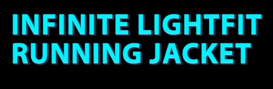
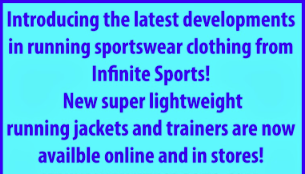
projects as the same products which were advertised across the two adverts (running trainers and running jacket) are included in my pop-up and sponsorship
sequence. However the products which I used across my projects do not reflect the brand colour scheme, which could of been a good way to further reinforce brand
awareness and create synergy.
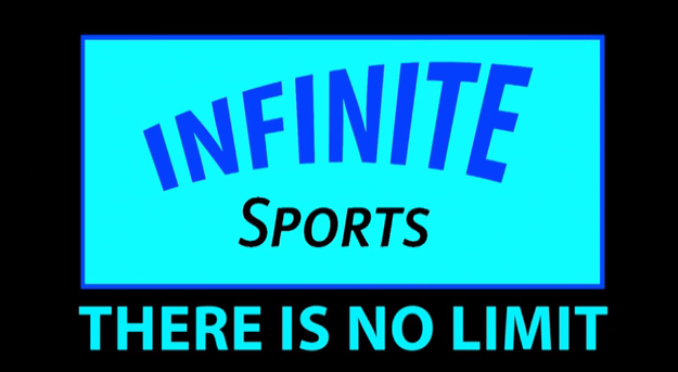
- As shown by these screenshots below from my main task and ancillary task projects, it is clear that I have provided synergy and therefore effective combination of all
texts through usage of the same company logo. The Infinite Sports logos shown are of the exact same colour scheme and design throughout, this reinforces brand awareness whilst
providing the audience with something which is recognisable, making my brand identifiable. However the size of the logo is different within each product peace in
order to fit the different individual layouts used within the different product designs and texts.
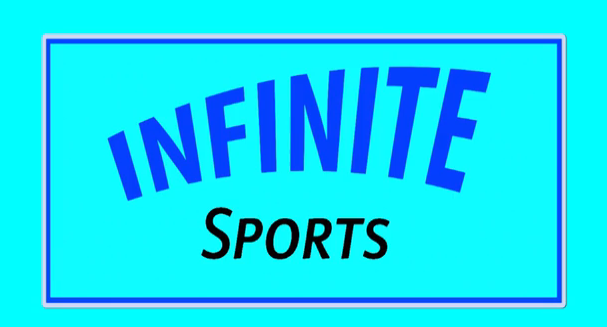
- When looking at the screenshots above it is also apparent that I produced effective combination between projects, by using a specific set of colours (turquoise blue and navy blue) to create a
brand colour scheme, which reinforces brand awareness and makes the brand identifiable to the audience. These colours make up the company logo on each of the projects for both my main and
ancillary tasks, whilst also making up the boarders and boxes which I used to present my web pop-up as seen above by the third image in from left to right. I used these colours as they are eye catching and stand
against black/white backgrounds. The screenshots below show that any writing included throughout my projects was also either presented using the turquoise and navy blue colours, or a combination of
the two, creating brand identification. I am pleased with the colour scheme synergy however I found it hard to match the navy colour writing on the sponsorship to the navy writing on the adverts and pop-up.
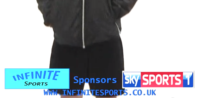
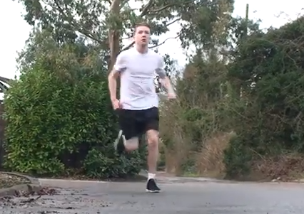
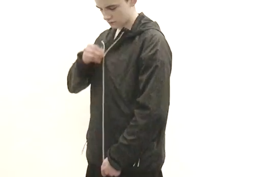
- Using the same male model within both of my main task adverts, has made him associated to Infinite Sports. This means that the audience will recognise him as an
Infinite Sports model before even recognising the Infinite Sports logo. This is beneficial as it allows the model to become a face of my brand, perhaps making him seem like a role
model which may attract audience members to the products he puts to use within the adverts, whilst also attracting them to the brand in general. I used a different male model
in the creation of my ancillary tasks, however once again I used just one model across both the texts (sponsorship and pop-up) to make the model Infinite Sports associated.
Using two models meant I had the possibility of creating two role model figures associated with my brand, which is beneficial to creating a positive brand image, in turn raising
popularity through synergy of using recognisable models. Main task model below to the left, ancillary model below to the right.
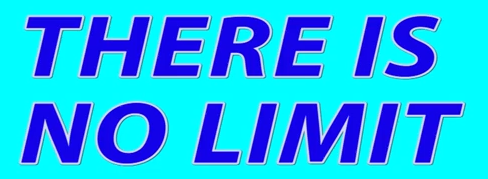
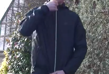
- Effective combination of my two main task projects and ancillary texts, is shown through the usage of my campaign title 'There Is No Limit' which appears in both of my adverts towards the end of the footage
and on my pop-up. Creating and using a campaign title across different project formats, allows the audience to associate it with my company Infinite Sports before the company name and logo is even shown.
Therefore the advert or pop-up becomes instantly recognisable to the audience through the use of the campaign title. Screenshots below to the left are from adverts 1 and 2 showing the use of my campaign
title, the screenshot below to the right is from my pop-up. I am pleased with the way I incorporated my campaign title across the different projects producing synergy, however I feel that I could of perhaps
included it somewhere in my sponsorship sequence also which would only work to further reinforce and establish brand identification.
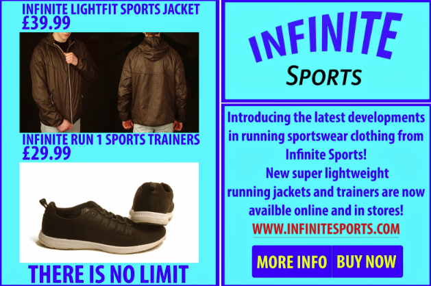
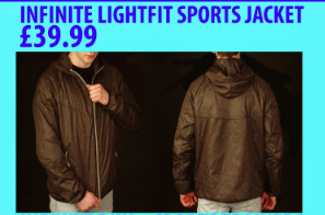
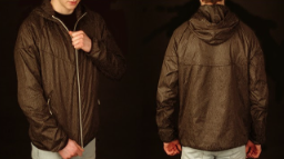
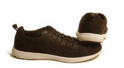
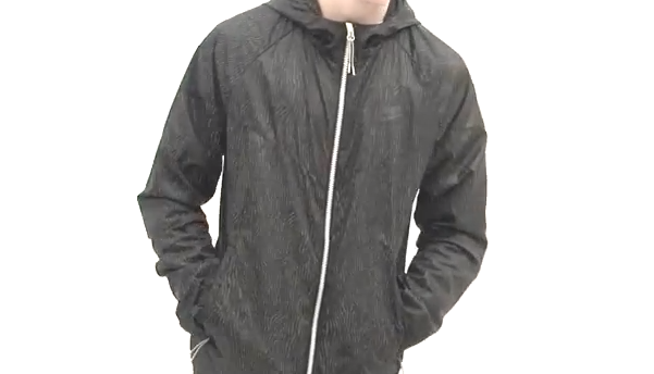
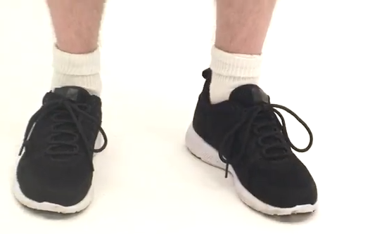
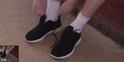
- Finally one of the most effective ways I combined my main products and ancillary texts is through using the same Infinite Sports range clothing in all of my project peaces. The trainers presented in advert 1 and the jacket in advert 2 are
both shown on my Infinite Sports pop-up and within my sponsorship. Although the main purpose of the pop-up and sponsorship is not to advertise my specific clothing, they both still work well in reinforcing the advertisement which I
presented in my two main task products. Audiences of all my project peaces will be able to identify them to my company Infinite Sports through repeat usage of the clothing range, making the project peaces identifiable. One comment I
can make for possible improvement is that I could of used the Infinite Sports trainers shown in advert 1, within advert 2 for the running jacket, as this would of reinforced advertisements for the trainers whilst advertising the jacket,
although I am happy with my final project peaces.
- The two screenshots above to the far right are from my Infinite Sports pop-up, showing both the jacket and trainers advertised in adverts 1 and 2, the screenshots in the centre are from my sponsorship sequence and
the two furthest to the left from adverts 1 and 2.
- The two screenshots above to the far right are from my Infinite Sports pop-up, showing both the jacket and trainers advertised in adverts 1 and 2, the screenshots in the centre are from my sponsorship sequence and
the two furthest to the left from adverts 1 and 2.
- Finally one of the most effective ways I combined my main products and ancillary texts is through using the same Infinite Sports range clothing in all of my project peaces. The trainers presented in advert 1 and the jacket in advert 2 are
both shown on my Infinite Sports pop-up and within my sponsorship. Although the main purpose of the pop-up and sponsorship is not to advertise my specific clothing, they both still work well in reinforcing the advertisement which I
presented in my two main task products. Audiences of all my project peaces will be able to identify them to my company Infinite Sports through repeat usage of the clothing range, making the project peaces identifiable. One comment I
can make for possible improvement is that I could of used the Infinite Sports trainers shown in advert 1, within advert 2 for the running jacket, as this would of reinforced advertisements for the trainers whilst advertising the jacket,
although I am happy with my final project peaces.
- Effective combination of my two main task projects and ancillary texts, is shown through the usage of my campaign title 'There Is No Limit' which appears in both of my adverts towards the end of the footage
and on my pop-up. Creating and using a campaign title across different project formats, allows the audience to associate it with my company Infinite Sports before the company name and logo is even shown.
Therefore the advert or pop-up becomes instantly recognisable to the audience through the use of the campaign title. Screenshots below to the left are from adverts 1 and 2 showing the use of my campaign
title, the screenshot below to the right is from my pop-up. I am pleased with the way I incorporated my campaign title across the different projects producing synergy, however I feel that I could of perhaps
included it somewhere in my sponsorship sequence also which would only work to further reinforce and establish brand identification.
- Using the same male model within both of my main task adverts, has made him associated to Infinite Sports. This means that the audience will recognise him as an
Infinite Sports model before even recognising the Infinite Sports logo. This is beneficial as it allows the model to become a face of my brand, perhaps making him seem like a role
model which may attract audience members to the products he puts to use within the adverts, whilst also attracting them to the brand in general. I used a different male model
in the creation of my ancillary tasks, however once again I used just one model across both the texts (sponsorship and pop-up) to make the model Infinite Sports associated.
Using two models meant I had the possibility of creating two role model figures associated with my brand, which is beneficial to creating a positive brand image, in turn raising
popularity through synergy of using recognisable models. Main task model below to the left, ancillary model below to the right.
- When looking at the screenshots above it is also apparent that I produced effective combination between projects, by using a specific set of colours (turquoise blue and navy blue) to create a
brand colour scheme, which reinforces brand awareness and makes the brand identifiable to the audience. These colours make up the company logo on each of the projects for both my main and
ancillary tasks, whilst also making up the boarders and boxes which I used to present my web pop-up as seen above by the third image in from left to right. I used these colours as they are eye catching and stand
against black/white backgrounds. The screenshots below show that any writing included throughout my projects was also either presented using the turquoise and navy blue colours, or a combination of
the two, creating brand identification. I am pleased with the colour scheme synergy however I found it hard to match the navy colour writing on the sponsorship to the navy writing on the adverts and pop-up.
- As shown by these screenshots below from my main task and ancillary task projects, it is clear that I have provided synergy and therefore effective combination of all
texts through usage of the same company logo. The Infinite Sports logos shown are of the exact same colour scheme and design throughout, this reinforces brand awareness whilst
providing the audience with something which is recognisable, making my brand identifiable. However the size of the logo is different within each product peace in
order to fit the different individual layouts used within the different product designs and texts.
Media attachments
Want to create your own Mind Maps for free with GoConqr? Learn more.