4386814
Evaluation Question 2 - How effective is
the combination of your main product
and ancillary texts?
- Typography - There was no specific theme with the typography of my
products but I did make sure that they were consistent throughout. I choose
particular styes form Dafont.com that i thought were interesting and would
stand out. I tried to incorporate different fonts into each of my tasks,
discovering new ones as i went. I made sure that the same fonts were used
throughout my magazine and especially with the tiles of the pages. I also
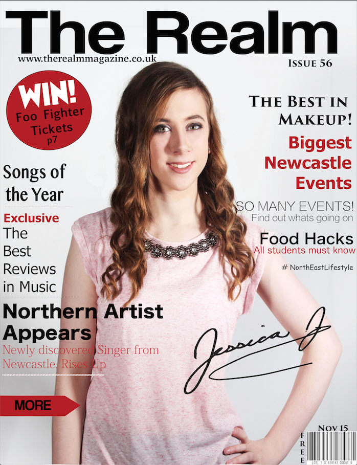
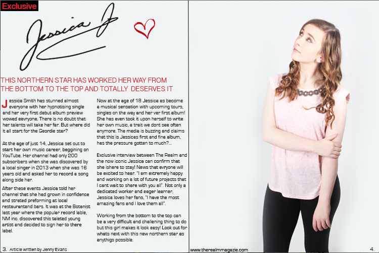
choose to use the signature on the cover page also on my double page spread
to link it with the story of the cover star and help make the magazine look
whole. When it came to my billboard i found new fonts and relied simply on
using the social media icons and the website addresses font to relate back to
my magazine. I initially decided to have my masthead a different font,
however I feel that this would differentiate to much between my magazine
and billboard so now my masthead is also the same font.
- For my website i used new typography that wasn't on my
magazine or billboard however i did still use the same
masthead. I used the same font throughout the website n
order to link them wight the title of the page being the
same as the masthead in all my products from my
magazine, billboard and to my website.
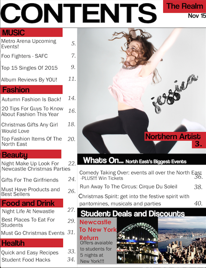
- Masthead - All my products have the Masthead involved, on each
page of the magazine, on the billboard and on each page of the
website., this was to keep it linking together as well as drilling in
the name of all my products into the readers head so that it
would be remembered and easily recognizable when seen again.
My masthead featured at top centre of my front cover than
continued to the top right of the contents page and again witt
he double page spread, this justifies its importance. The
masthead on my billboard is the main attraction along with the
image and is centered in the middle. This is the first thing the
audience will see and remember it so that when hey see it on
my other products it will become easily recognizable. This is the
same for my website, it will be the first thing seen and
therefore help to relate to my other products and give the
import ace and message to the audience.
- colours - I find that the colours I have used is the most important
link between all of my products, Because of the constant change in
fonts and layout I have used colours too keep more balance within in
my products an a way to make them look part of the same
collection.. Keeping the colour scheme ensured that all my products
came together as one. The colours that had chosen were quite
conventional with red, black white and grey, I chose these due to the
neutral colours and then the pop of red which would help it to stand
out. I feel my colours contrast well helping it to be noticed, I also feel
that the red which has been used throughout each product helps to
make it reconsiable especailly witht he brightness of the red which
isnt seen around that often, it stands out between the white and
grey backgrounds. The double page spread relied on the reds pop of
colour to separate different sections and make it look more
interesting. T
- The red helps to warm my products up and makes them feel more inviting and
welcoming, which was my initail l aim. Because it is a a warmer colour unlike
blues I think that it works best to have a more open feeling and welcoming.
Also because of the grey tones i think that it contrasted well. With my
anciillary tasked I kept mainly the gre and black tones with maybe hints of the
red. I didnt want it to be too over powering in these tasks but still noticable.
This heled to keep a more subtle link to my products.
- Images - My images did not have much variation and were are very similar throughout each product, this being with the same
model and the same clothing witht the poses separating and making the images a bit different. My website and magazine shared
the same model from the same photoshoot which links it well and makes it look believable as a combined product showing that
the same features are on both the magazine and the webiste. My billboard had the same model however from a different
photoshoot showing a different side to the star with different clothing and different poses, this give a more interesting feel and
more difference so that everything is not to similar, I think that shows professionalism. My magazine allowed me to capture
more emotion and centre on the star induvidualy whereas my ancilary tasks, I focused more on selling the product and making it
look professional and wanted. My website especaily I tried to include regional images of places like Newcastle.
- My website allowed me to have wider view of images with different people and places, however I still
kept the link through using some form my magzine.
- My website allowed me to have wider view of images with different people and places, however I still
kept the link through using some form my magzine.
- Content - This helped a lot to relate back to the different products, for
example my website features the magazine issue with the intent of gaining
subscriptions. I also featured the same model in both which is relating to the
article that is on my double page spread and is also advertised on my
website.. On my magazine and my billboard I have the website URL stated on
both of them as well as social media on my billboard and webiste. It also
helped to link my products together by the regional content,I chose to do this
in a more area based way by adding names of places.
- Overall the impact that my company will have by
making these products link in subtle or direct ways
will benefit my work and the audience. My magazine
will be in higher demand through recongisibilty from
the features I have used throughout each task.
Gaining feedback on each product has helped to make
improvements on how to effectively use features on
all platforms in order to appeal more to the audience.
- Typography - There was no specific theme with the typography of my
products but I did make sure that they were consistent throughout. I choose
particular styes form Dafont.com that i thought were interesting and would
stand out. I tried to incorporate different fonts into each of my tasks,
discovering new ones as i went. I made sure that the same fonts were used
throughout my magazine and especially with the tiles of the pages. I also
choose to use the signature on the cover page also on my double page spread
to link it with the story of the cover star and help make the magazine look
whole. When it came to my billboard i found new fonts and relied simply on
using the social media icons and the website addresses font to relate back to
my magazine. I initially decided to have my masthead a different font,
however I feel that this would differentiate to much between my magazine
and billboard so now my masthead is also the same font.
Media attachments
Want to create your own Mind Maps for free with GoConqr? Learn more.