
Flashcards
CSS
Flashcards do conjunto (16)
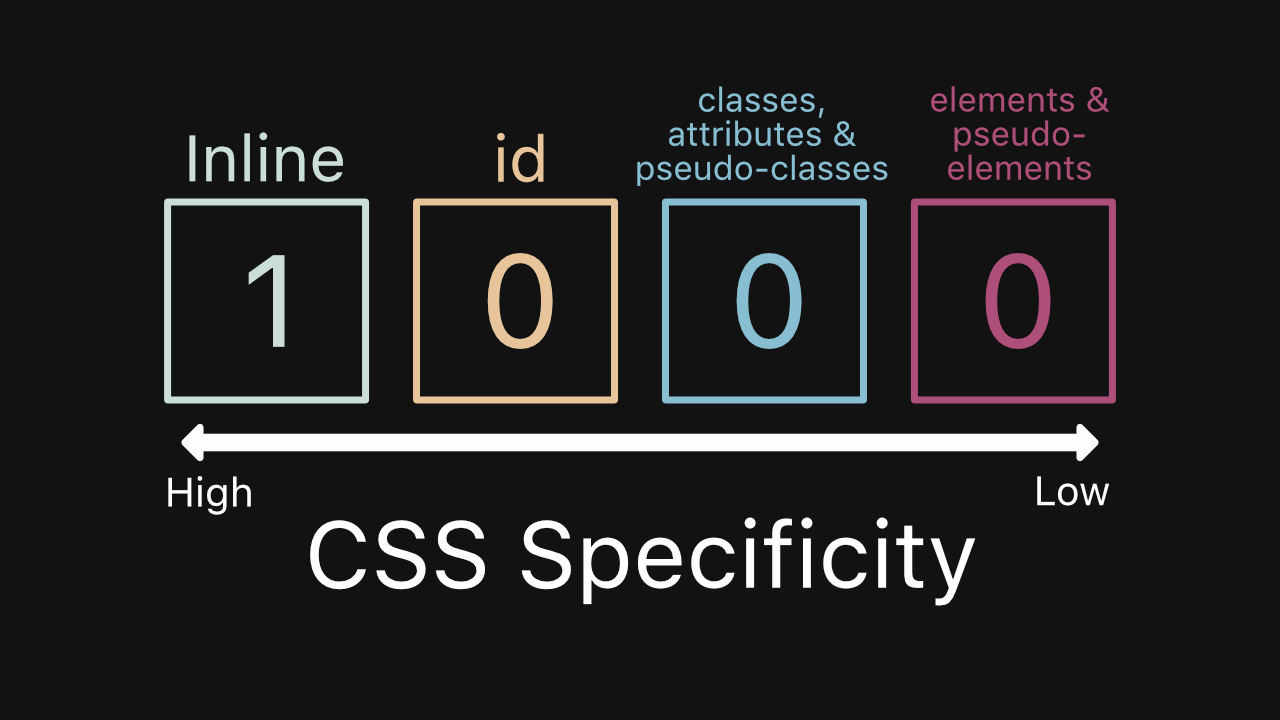
- 1What is CSS specificity ?A set of rules by which browsers decide which CSS property values are the most relevant to an element
- 2What's the difference between "resetting" and "normalizing" CSS? Which would you choose, and why?Normalizing retains the default styles that are useful and removes those that are not whereas the reset removes all the styles of the browser
- 3What are Floats and how they work.takes the element out of the normal flow of the document, and wraps around itself line boxes that come after the element
Items floated to the left, move to the left edge of its container and those floated to the right move to the right edge. - 4What are media QueriesThey look at the capability of the device.
check many things, such as:
width and height of the viewport
width and height of the device
orientation (landscape/portrait mode)
resolution - 5Can you explain the difference between px, em and rem as they relate to font sizing?px (pixel) is an absolute unit.
em (em) is a relative unit that is based on the font size of the parent element
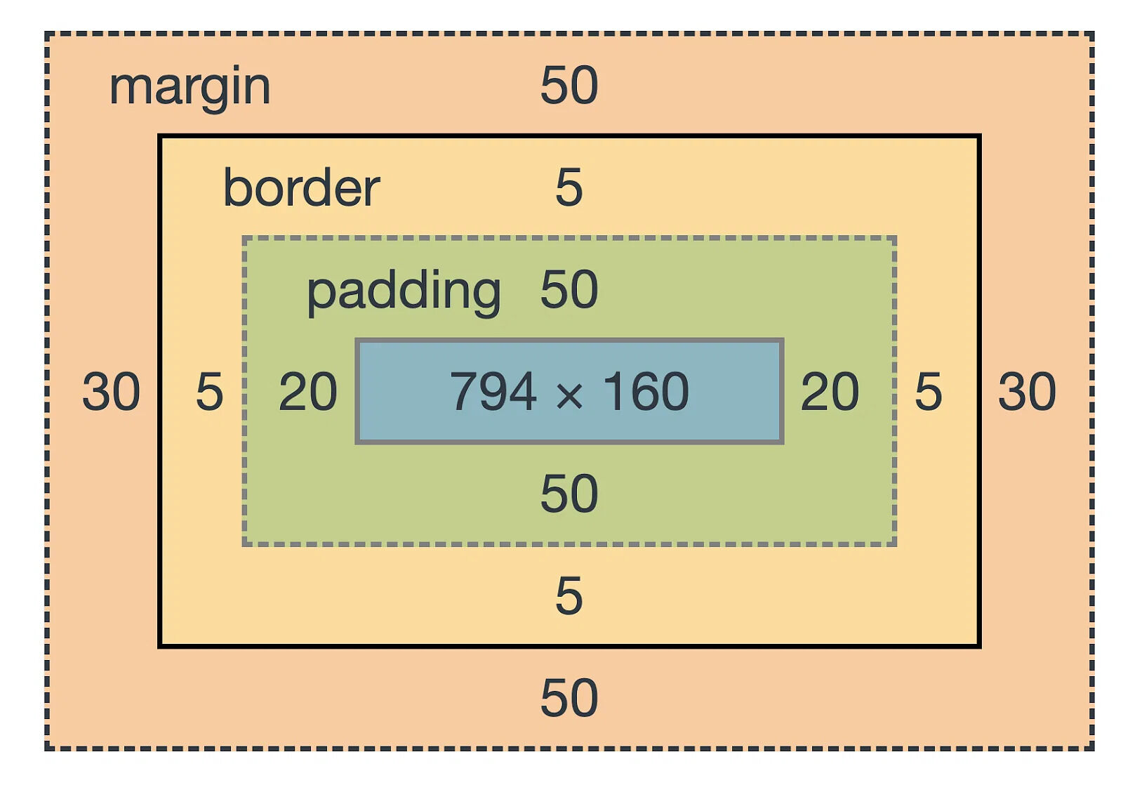
rem (root em) is a relative unit that is based on the font size of the root element - 6Explain the CSS box modelThe CSS box model is a container that contains multiple properties including borders, margin, padding, and the content itself.
- 7Explain the CSS box model
- 8What is Static positioningIs the default value, all elements are in order as they appear in the document.
- 9What is Relative positioningThe element is positioned relative to its normal position.
- 10What is Absolute PositioningThe element is positioned
relative to the first relatively or absolutely positioned parent element. In the case when there is no positioned parent element, the element set to absolute will be positioned related directly to the HTML element - 11What is Fixed PositioningThe element is positioned related to the browser window.
- 12What is Sticky PositioningThe element is positioned based on the user’s scroll position.
- 13What's the difference between inline and inline-block?Compared to display: inline , the major difference is that display: inline-block allows to set a width and height on the element.
- 14Differences Between Responsive Design and Mobile-First DesignA responsive website is reactive , the design moving fluidly to fit devices. A mobile-first is when the mobile site planned and designed in tandem with the desktop site, making proactive changes to the overall design to ensure the mobile is just as good as the desktop
- 15What are the different ways to visually hide contentdisplay:none
visibility: hidden
HTML hidden attribute
Absolutely positioning content off-screen - 16What are the different ways to visually hide content (and make it available only for screen readers)?Absolutely positioning content off-screen
Having a special class (.sr-only) that toggles visibility between devices using media queries
Informações
- Descrição
- Otro CSS FlashCards sobre CSS, criado por Jose Arias em 12-10-2023.
- Criado por
- Jose Arias · out 2023
- Atualizado
- 12 out 2023
- Visualizações
- 1
- Avaliação