6927466
Description
Mind Map by Natasha Davies, updated more than 1 year ago
|
|
Created by Natasha Davies
over 7 years ago
|
|
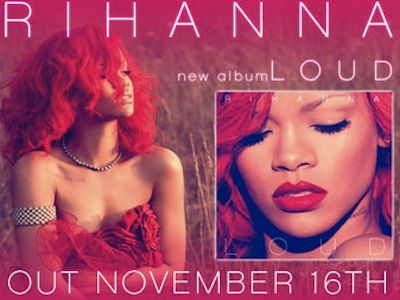
Magazine Advert Analysis
- Red is the main colour and this could appeal to
Rihanna's target audience (teenager/young adult
females) as red connotes love which suggests that
the album is going to be focused around love songs-
this would appeal to Rihanna's target audience as
stereotypically teenage girls only care about boys
and want love
- The artist face is seen on the majority of the
magazine advert and this attracts the target
audiences attention. If some of Rihanna's
fans were to see this advert they would be
able to tell straight away who the advert is
promoting (Rihanna) and want to find out
more information about it immediately as
they would already be fans. It would also
attract people who aren't fans as they could
be curious as to who the person is and want
to find out more about the advert.
- The focus of the advert is on Rihanna.
In the image on the left she is
dressed nicely and this could be to
appeal to a male target audience who
may not necessarily like her music,
but they could be drawn in by her
physical appearance. This magazine
advert is used successfully in a
voyeuristic manner. The image on the
right is a close up of her face which
again draws people in as they would
be focusing on just her looks, but it is
also the image of the album cover
which alerts people who look at the
advert of what to look for in shops if
they want to get her new album.
- There is only a minimum
amount of writing on the
advert which means that
there is nothing to distract
you from the important
information which is
displayed in bold white
writing which contrasts
with the bright red. The
most important
information is the artists
name- Rihanna, the name
of the album- LOUD, and
the release date-
November 16th.
- Red also connotes danger which links
to the title of the album "LOUD". The
colour red stands out, just like,
danger and people are usually drawn
to danger so because of the red
people will be drawn to the advert.
Media attachments
Want to create your own Mind Maps for free with GoConqr? Learn more.