
10. Red and Blue together are hard on the eyes
Slides in this set (4)
-
- Chromostereopsis
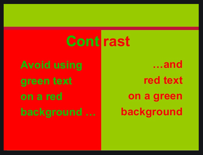
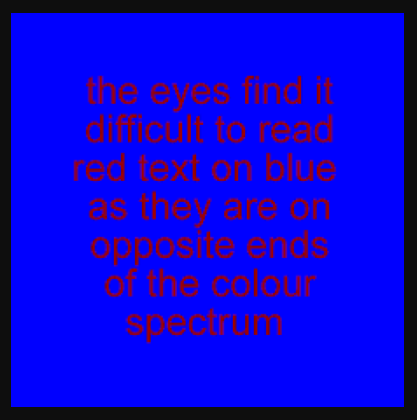
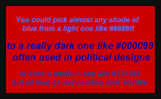
- refers to the visual illusion of depth that is created when one color is more prominent than the other, usually seen with red and blue or red and green.
- These color combination can cause text to be hard to read or images to be hard on the eyes
- It is best to avoid blue or green text on red backgrounds and vice versa.
-
-
-
Information
- Description
- These color combination can cause text to be hard to read or images to be hard on the eyes.
- Created by
- Samuel Fuentes · Oct 2020
- Updated
- Oct 26, 2020
- Views
- 50
- Tags
- Rating